Flyers have long been a staple in the world of marketing, offering a cost-effective and direct way to reach potential customers. Whether you’re promoting a local event, advertising a sale, or launching a new product, a well-designed flyer can capture attention and drive action. While digital marketing continues to grow, printed flyers still hold their place as a powerful tool to engage with audiences in a tangible way.
HelloPrint offers the perfect flyer & leaflet printing solution for businesses looking to create eye-catching, high-quality flyers that make an impact. By combining creative design with professional printing services, you can ensure your flyers stand out and communicate your message effectively. In this guide, we’ll explore how to design and print flyers that truly fly off the shelves.
The Importance of Flyers in Marketing
Why Flyers Still Work in a Digital Age
While much of today’s marketing focus has shifted online, flyers continue to be a highly effective method of reaching your audience. Physical flyers have the advantage of being tactile; they can be handed out directly to potential customers, left in strategic locations, or included in packages or mailings. Unlike digital ads that may disappear in a sea of content, a well-designed flyer can leave a lasting impression.
Flyers also provide an immediate way to showcase your brand, highlight offers, or promote events. They’re versatile enough to be used in a wide range of settings, from shops and cafes to events and street promotions. With the right design and strategy, they can still be a key part of any marketing campaign.
Reaching the Right Audience with Targeted Flyers
One of the biggest strengths of flyer marketing is the ability to reach specific audiences. By distributing flyers in areas where your target market is likely to be, you can ensure that your message is getting in front of the right people. For example, a restaurant could distribute flyers locally to advertise a new menu, or a fitness studio might hand out promotional flyers at community events.
Targeting specific locations or demographics allows you to engage directly with potential customers, increasing the likelihood that they’ll take action. Whether it’s encouraging foot traffic to a brick-and-mortar location or promoting a limited-time offer, flyers give you the opportunity to focus your marketing where it counts most.
Designing Flyers That Stand Out
Focus on Clear, Compelling Headlines
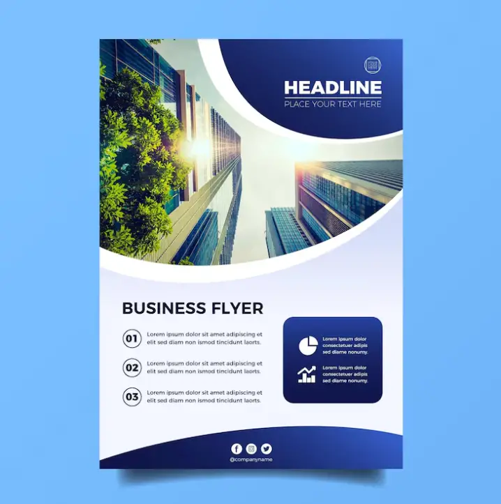
The headline is the first thing people notice when they pick up your flyer, so it’s important to make it count. A strong, attention-grabbing headline should immediately communicate the essence of your message. Whether it’s announcing a sale, promoting a new service, or highlighting an event, the headline needs to be clear, concise, and engaging.
Think about what would catch your audience’s eye and motivate them to keep reading. Phrases like “Exclusive Offer,” “Limited Time Only,” or “New in Town” can create a sense of urgency or curiosity that drives action.
Eye-Catching Colours and Imagery
Colour plays a vital role in flyer design. Bright, bold colours can draw attention, but it’s important to choose colours that align with your brand and the message you want to convey. Consistency with your brand colours helps reinforce your identity, while the use of contrasting colours can make certain elements, like your headline or call to action, stand out.
In addition to colours, high-quality imagery or graphics are crucial for making your flyer visually appealing. Choose images that are relevant to your message and that enhance, rather than overwhelm, the design. Striking visuals will help convey your message quickly, especially for those who may only give the flyer a quick glance.
The Balance of Text and White Space
While it may be tempting to fill every inch of your flyer with information, less is often more when it comes to effective design. White space, or the areas left intentionally blank, helps to give your flyer a clean and professional look. It allows your text and imagery to breathe, making it easier for readers to focus on the most important elements.
Keep your text concise, and focus on delivering the key details without overwhelming the reader. Bullet points, short sentences, and plenty of space between sections make the flyer more readable and visually appealing.
Choosing the Right Paper and Finish for Maximum Impact
Paper Types That Match Your Message
The quality of your flyer’s paper can significantly impact how it’s perceived. Thin, flimsy paper might give the impression of a budget operation, while thicker, higher-quality paper conveys professionalism and attention to detail. Consider your audience and the message you want to send when selecting your paper type.
For instance, a luxury brand might opt for a heavier, more textured paper to reflect the quality of their products, while a local cafe advertising a weekend offer might choose a lighter paper that’s cost-effective for widespread distribution.
Matte, Gloss, or Silk? Choosing the Best Finish
In addition to paper weight, the finish of your flyer also plays a key role in how it looks and feels. Matte finishes offer a more understated, elegant look and are ideal for flyers with lots of text. Gloss finishes, on the other hand, give a shiny, vibrant appearance that makes colours pop, perfect for flyers with strong imagery.
Silk finishes offer a balance between matte and gloss, providing a smooth texture with a slight sheen. Choosing the right finish depends on the style of your design and the impression you want to leave on your audience.
Ensuring Your Flyers Are Effective
Including a Strong Call to Action
Every flyer should include a clear and compelling call to action (CTA). The CTA tells your audience what you want them to do next, whether that’s visiting your website, attending an event, or taking advantage of a special offer. Make your CTA stand out by placing it in a prominent location and using action-oriented language like “Visit Us Today” or “Claim Your Discount.”
A flyer without a CTA is a missed opportunity. Ensure your message is clear and that your audience knows exactly what steps to take after reading your flyer.
Maximising Distribution for Better Reach
Once your flyers are printed, the next step is making sure they reach your audience. Consider where your target customers are most likely to be and distribute your flyers in those locations. Whether it’s handing them out in person, placing them in local businesses, or including them in direct mail campaigns, strategic distribution is key to maximising their effectiveness.
Think creatively about how you can get your flyers into the hands of the right people, and remember to track the success of your flyer campaigns to understand what works best for your business.
Conclusion
Flyers remain a powerful and effective marketing tool, allowing businesses to communicate directly with their target audience in a tangible way. By focusing on strong design elements, choosing the right paper and finish, and distributing them strategically, you can create flyers that truly fly off the shelves and drive customer engagement.
With the support of professional printing services like HelloPrint, you can ensure your flyers are designed and produced to the highest standards, helping your business make a memorable impact. Whether you’re promoting an event, advertising a special offer, or simply building brand awareness, well-designed flyers are a proven way to boost your marketing efforts.

