Photo: Shutterstock.com
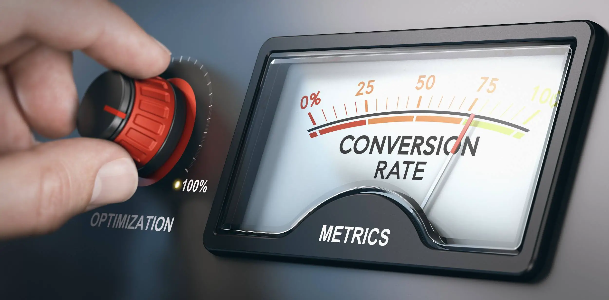
Aiming at a high conversion rate, or making a user fall in love with your site.
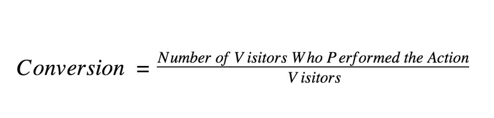
Site Conversion means ratio of number of visitors, having performed certain
actions (purchase, registration) on the site, to a total number of visitor.
Judging by the definition, the conversion seems to be a definite value. Accurately calculated and determined.
It may seem to be a case of pallid statistics.
But avoid rushing to a conclusion.
Conversion is focused on visitors. Site visitors are living people. These people let emotions run away with them,
respond to psychological “traps” or depend on the mood of the spur of the moment.
For this reason, website CRO covers:
- accurate calculations and clearly defined program, on the one hand;
- studying and understanding psychological/emotional/age-related peculiarities of visitors’ perception and ways to impact it, on the other hand.
In this article, we are offering you 7 tips how to increase website conversion rate and prepare therefore.
TIP No. 1: START WITH REALISTIC AND SPECIFIC GOAL
Prior to optimization, we need to determine, what exactly we intend to achieve (raise sales, increase brand awareness, receive more responses).
The goal to be achieved shall be not abstractly formulated but presented in specific values.
For example,
We set a goal to increase the sales by 50% within 3 months.
Are there any average values to use as targets?
The universal average conversion rate is impossible to be determined, as the value will always depend on:
- product and/or service offered;
- a scale of business;
- average order cost;
- platform (Windows, Mac, Android, iOS);
- goal to be achieved: in some cases, we calculate the percent of the visitors have filled in the order form, while in other cases we refer to the percent of the visitors have created an account, etc.
From this point of view, if you ever compare any values, be guided by sites of the same industry with similar parameters.
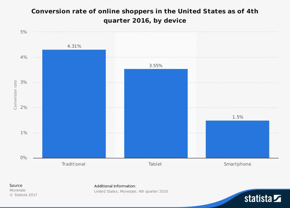
For example,
During the first quarter 2017 in the USA in e-commerce, 3.06% of the
tablet-users were converted from visitors to buyers.
Are your company engaged in the same business within the same region?
What values did you manage to achieve during the same period?
Now we have the specific goal set to be achieved.
TIP No. 2: PRIOR TO STARTING OPTIMIZATION, ANALYZE CURRENT STATE
We need to track visitors’ behavior on the site, and monitor, which content elements cause feedback and which fail to, which calls to action (CTA) motivate users to act, what is the traffic generated by visitors (incoming and outgoing), etc.
At this stage, we need to be aware of eventual problems and things to remain unchanged to avoid getting worse.
Use online diagnostic tools, such as:
- Google Analytics, Kissmetrics, Clicky (analytics);
- HotJar (heatmaps);
- Google Optimize (A/B tests).

Using these (similar) tools we proceed as follows:
- gather site statistics;
- record results;
- draw conclusions;
- organize brainstorms to determine changes required;
- perform constant testing using various variants to find out the variant with the required visitors’ feedback.
TIP No. 3: OPTIMIZE UI/UX
What does the user see when entering the site? The user interface (UI).
What does the user bring with and take away when leaving the site? User experience (UX).
That is, these two components form the path that the visitor follows when researching your site. Make it as simple and as comfortable as possible, and leading to where you want your potential client to arrive.
UI/UX recommendations:
- choose between responsive and adaptive design;
Have any doubts about the choice? Responsive vs
adaptive web design article will help you to come clear.
- offer simple registration procedure (exclude unnecessary questions and registration fields);
- convince visitors that the site is safe (add logos of payment systems you collaborate with, or security systems used to protect information);
- use online chat rooms (make sure that visitors always receive quick and appropriate feedback);
- post the customers feedback (real reviews of real customers only);
- make navigation easy: the user doesn’t expect any puzzles and escape rooms (unless it’s your specialization).
TIP No. 4: TEST, TEST, AND TEST ONCE AGAIN!
Every new step brings us closer to success. So, we just accept things as they are: we need to continue making a new hypothesis, introducing new elements and changing the site. This is the only way to adapt in a flexible manner to users’ demands, staying on trend and being aware of the real state of things with the site.
Any results and consequences caused by the site changes introduced shall be continuously traced and tested. Otherwise, the efforts aimed at improving website conversion rate will be useless.
Please, keep in mind,
Changes are made for the sake of the result,
but not for the sake of changes.
Spare no time and efforts for А/В testing.
The method itself is simple: some (two, as a rule) variants of one or another site element are created and posted. Then, we analyze, which variant appeared to be more effective.
Variants subject to testing shall consider the following:
– no matter, how sophisticated you are in your tastes and how wide is the range of your interests, your site is created for users but not for you. And these are testing and result in analysis, that help to gather the required accurate data and build the site based thereon. The site that is user-friendly and interesting, and a nigh-on magnetic attractive for the users.
– prior to offering any test variant, define what visitors category it is addressed to and what we need to clear out. Different users behave differently on the site:
- the first-time visitor will view the content more closely;
- the visitor who has already found the promotional offer will most probably search for the specific information only;
- the repeated visitor will focus on some new pieces of information or on the information that appeared to be interesting during the first visit.
You may define your own user categories. Think over, what you may offer to any of them. And create the variant that would be difficult to ignore.
TIP No. 5: CONSIDER PSYCHOLOGICAL ASPECTS
You can hardly attract the buyer being unaware of his/her drivers, preferences, and needs. So, having started with improving the site conversion rates, you will this way or another have to master some psychological aspects.
Make use of the experience already gained by psychologists and marketing experts. People may belong to the generation X, Y or Z, but the values common to humanity persist.
In psychology no detail is too small:
- starting from the color used,
Different colors trigger different emotions and are interpreted differently in various countries. This is to be considered and properly used.
Have you ever wondered, why many of the communication-focused brands (Facebook, Twitter, Skype) use blue as one of the key colors?
The reason is that this color is credible and evokes safety sensation. The visitors reveal their thoughts, data, and information to the sites contributing to their development.
- trusting the brand in general.
The visitors perceive emotionally the way the brand is presented in various social media. Your site and brand will win their hearts and love provided they do not find any discrepancies and inconsistencies.
Though it may sound melodramatic, does not the “high conversion rate” imply both emotional and reasonable choice?
Our team does care both about our clients’ emotions and satisfaction.
Do you want to make sure? Contact Umbrella right now, and we
will add fresh colors to your ideas in the field of
mobile and web development.
So, we take into account the goals set, diagnostics results, users’ psychology and move on to changing content, CTA and navigation in order to make the site more user-friendly and attractive.
TIP No. 6: PAY SPECIAL ATTENTION TO CALL TO ACTION ELEMENTS (CTA)
These elements include interactive buttons that inspire the user to act (register, install software, subscribe, make a purchase).
There are specific CTA rules. No doubt, you may also find your own way. But users have some experience already with other sites and offering them something completely new you risk to be misunderstood.
CTA Recommendations:
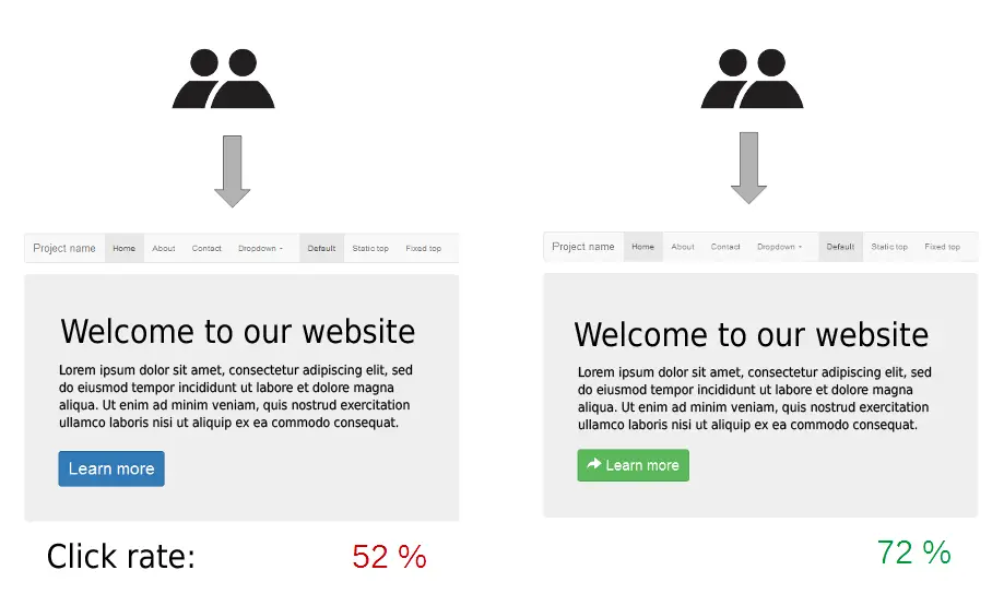
- the button shall be contrasting to show up on the site.. But the general style of the site shall be preserved;
- the button shall include a clear and well-formulated call to action;
- the user shall be offered a choice. Avoid overplaying. The great variety may beat out of reason. You are recommended to offer, maximum, 2-3 options;

Here is an example of user motivation by Skype. You are offered to Start a conversation or Download Skype. Those, who are not aware of the service, may See what they can do.
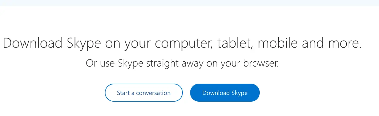
As you are ready with the content, you will be once again offered two clearly defined options. Clear and easy.
The techniques and options to design CTA elements are numerous. This is just one example. Once again be reminded: never underestimate the significance of CTAs. They serve as a link in the conversion of a visitor into a buyer (customer/subscriber). Do not allow this link to be the weakest.
TIP No. 7: IMPROVE THE CONTENT
The visitor is in search of information. Give it. If your site is focused on definite services or sale of definite products, fill it with accurate data, clear instructions and useful facts. But do not overload with unnecessary information.
The user’s interest can be maintained as follows:
- use the content focused on the target audience (not useful or exciting to you, but exactly what your potential customers are interested in);
- use high-quality content only (unique texts and images, own research data);
- use various formats of the content (images, photos, videos, articles, press releases);
- keep updating the content (making the user feel that the site “lives”);
- do not present information in full (motivating the user to contact you to clarify the details);
- think about a distribution of the content in various social networks and on various resources (use cross-links to own previously published materials, take into account SEO requirements);
- maintain the frequency of content updates and announce new publications and promotions (stirring up the interest).
And do not forget to analyze the results to check whether you are moving in the right direction.
In this article, we have offered you 7 tips to help you identify a general approach to increase website conversion rate. But Umbrella always gives clients more than promised. Please, enjoy the bonus: the eighth tip.
TIP No. 8: BE PATIENT
Do not expect any quick results. You have a long and thorny path ahead (any professional website conversion optimization services provider will confirm, that first optimization results will not appear before a few months).
BUT, never give up. The more errors you detect and eliminate, the closer you will move towards achieving the goal.